
Data data data!
Part of the purpose of this blog is to study how I progress on two wheels. To do this without too much expense there are a whole host of gadgets, devices, apps and web tools that can be used for simple analysis. Some methods (that obviously cost a lot more) are extremely accurate. Others will give a rough indication. Some merge your data with expected data along with your own inputed metrics to give values within a percentage error.
Depending on the resolution you are looking for, various methods will give different indicators and can be used to assess performance. If you are looking for second by second data, then their maybe a high degree of uncertainty. If you are looking for weekly/monthly trends over larger dataset, then more firm indications can be made.
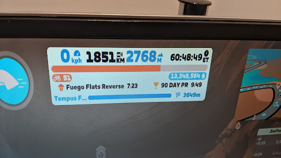
For the past three to four years, my core tools have been relatively simple, low tech and cheap in the sports technology landscape. Originally it was a smart phone, now it is a Garmin 510 with an assortment of fairly cheap sensors. For daily riding the Garmin is as robust as they come and pretty much the default modern bike speedo (no more jotting down numbers in the backs of jotters to work out what you've done. Remember the pre GPS days???) Instead, the the little black box can record as much or as little as required and throw up trends you wouldn't think possible.
Anyone want a temperature v's dat graph?? You couldn't do this in the 80's!

Coupling to the Garmin, there are thousands of Ant+ sensor ranging from a simple heart rate monitor through to power meters and virtual trainers. For my personal use, I have used heart rate, speed and cadence on a number of bikes along with the standard GPS, altitude and temperature tracking which is thrown into the 510.
So what doe is show? A lot of .gpx files. Having thousands of files is pretty much useless unless you want to use them, so..... how?
As Garmin uploads to Garmin connect, the first thing to do is link Connect to all the other service providers who in my opinion do a better job than Garmin. Their refreshed app is nice, but Garmin's strength is its hardware.
From Garmin, the data can be thrown straight out to Strava, MyFitnessPal and Google fit (plus others). It can also be thrown out through third parties to Dropbox accounts (more on that later). In Strava you can do the vanity things of willy waving and the community stuff to see who pisses the highest and there is also some good analysis - so I've heard. Personally I haven't gone for Strava premium for a number of reasons. Firstly is the cost. £40 isn't too much, but there are other services (starting at £10 or less) which I think are more valuable. Secondly, Strava has lost some of it's value as it has grown. My biggest gripe is the number of segment. If my postman ran down our drive he could try and gain a KOM.
Where things get interesting is when you start to use the data in other areas. My style is not the punch sprint - there are to many Dura Ace Dogma F8 mamils in the area for this to be of any interest. Kudos to the likes of my former workmate with his punch short KOMs, on short rides, but to me a high place (somewhere in the 20's on a 200+ rider segment) after 120km in the legs and another 80 km to go to me is more important than a top 10 when you've only done 20 km in the whole ride.
And that is where Veloviewer comes in. Veloviewer score take this into account and weigh your score accordingly. But this is just scratching the surface.
Power!
This blog is about improvement, so let's start to look for some. As Strava works out your estimated power output based on GPS data, your bikes mass and your mass, selecting bikes, narrowing down rides and so can give data trends over the months to years. Unedited, it looks something like this:

This includes everything - a bit of mountain biking, pootle to the shops, rides with kids, pulling a trailer, rides back from errands and school runs, a run and walk or two........
Start refining the data, and the tools become more useful. Removing anything on 26 inch wheels, anything on a tandem, utility bikes and general messing around, I can start to pull data into one week time periods to give an average power for that week. Now my data looks something more meaningful.

As the error will be consistent as the same methods are used and I am comparing like for like (not this data to another rider), any error should be within a margin. As this is estimated, Strava claim within 5% compared to power meters. I take this with a pinch of salt, so these values are not absolute but trend indicators.
From this, some clear trends pop out. My 2014 was clearly weaker than 2015 - I improved! More importantly, I improved through 2015 from a 140W average week at the start of january to a peak average of 232W in week 33 (12th August) and the weakened going into autumn, but not as far as the start of the year - the number and nature of riding changing accounting for the biggest effect. Broadening the timeframe to month time sections, I can see I clearly peaked in August (two sportives, a number of very high paced rides and come from my longest ride mid-late July).

To the future.
All this data is good to show how well I performed, but should always be seen as how well I can perform next year. So far November has followed the trend usually observed - distances decrease in the winter months as training becomes harder and the fatigue of the year bites. But encouragingly, the rate of decline is slower than previous years. I can see that when I reduced training around week 37 and 42 of 2015, the rot set in and my average weekly power output decreased. But by returning to HIITs on the turbo and restarting, I can still average 200W on a 22km commute even in the worsening weather. This gives hope that the starting point in January 2016 will be higher than the 132W average for January 2015.
All this from a little box hanging over the front of the stem.....
Depending on the resolution you are looking for, various methods will give different indicators and can be used to assess performance. If you are looking for second by second data, then their maybe a high degree of uncertainty. If you are looking for weekly/monthly trends over larger dataset, then more firm indications can be made.
For the past three to four years, my core tools have been relatively simple, low tech and cheap in the sports technology landscape. Originally it was a smart phone, now it is a Garmin 510 with an assortment of fairly cheap sensors. For daily riding the Garmin is as robust as they come and pretty much the default modern bike speedo (no more jotting down numbers in the backs of jotters to work out what you've done. Remember the pre GPS days???) Instead, the the little black box can record as much or as little as required and throw up trends you wouldn't think possible.
Anyone want a temperature v's dat graph?? You couldn't do this in the 80's!

Coupling to the Garmin, there are thousands of Ant+ sensor ranging from a simple heart rate monitor through to power meters and virtual trainers. For my personal use, I have used heart rate, speed and cadence on a number of bikes along with the standard GPS, altitude and temperature tracking which is thrown into the 510.
So what doe is show? A lot of .gpx files. Having thousands of files is pretty much useless unless you want to use them, so..... how?
As Garmin uploads to Garmin connect, the first thing to do is link Connect to all the other service providers who in my opinion do a better job than Garmin. Their refreshed app is nice, but Garmin's strength is its hardware.
From Garmin, the data can be thrown straight out to Strava, MyFitnessPal and Google fit (plus others). It can also be thrown out through third parties to Dropbox accounts (more on that later). In Strava you can do the vanity things of willy waving and the community stuff to see who pisses the highest and there is also some good analysis - so I've heard. Personally I haven't gone for Strava premium for a number of reasons. Firstly is the cost. £40 isn't too much, but there are other services (starting at £10 or less) which I think are more valuable. Secondly, Strava has lost some of it's value as it has grown. My biggest gripe is the number of segment. If my postman ran down our drive he could try and gain a KOM.
Where things get interesting is when you start to use the data in other areas. My style is not the punch sprint - there are to many Dura Ace Dogma F8 mamils in the area for this to be of any interest. Kudos to the likes of my former workmate with his punch short KOMs, on short rides, but to me a high place (somewhere in the 20's on a 200+ rider segment) after 120km in the legs and another 80 km to go to me is more important than a top 10 when you've only done 20 km in the whole ride.
And that is where Veloviewer comes in. Veloviewer score take this into account and weigh your score accordingly. But this is just scratching the surface.
Power!
This blog is about improvement, so let's start to look for some. As Strava works out your estimated power output based on GPS data, your bikes mass and your mass, selecting bikes, narrowing down rides and so can give data trends over the months to years. Unedited, it looks something like this:

This includes everything - a bit of mountain biking, pootle to the shops, rides with kids, pulling a trailer, rides back from errands and school runs, a run and walk or two........
Start refining the data, and the tools become more useful. Removing anything on 26 inch wheels, anything on a tandem, utility bikes and general messing around, I can start to pull data into one week time periods to give an average power for that week. Now my data looks something more meaningful.

As the error will be consistent as the same methods are used and I am comparing like for like (not this data to another rider), any error should be within a margin. As this is estimated, Strava claim within 5% compared to power meters. I take this with a pinch of salt, so these values are not absolute but trend indicators.
From this, some clear trends pop out. My 2014 was clearly weaker than 2015 - I improved! More importantly, I improved through 2015 from a 140W average week at the start of january to a peak average of 232W in week 33 (12th August) and the weakened going into autumn, but not as far as the start of the year - the number and nature of riding changing accounting for the biggest effect. Broadening the timeframe to month time sections, I can see I clearly peaked in August (two sportives, a number of very high paced rides and come from my longest ride mid-late July).

To the future.
All this data is good to show how well I performed, but should always be seen as how well I can perform next year. So far November has followed the trend usually observed - distances decrease in the winter months as training becomes harder and the fatigue of the year bites. But encouragingly, the rate of decline is slower than previous years. I can see that when I reduced training around week 37 and 42 of 2015, the rot set in and my average weekly power output decreased. But by returning to HIITs on the turbo and restarting, I can still average 200W on a 22km commute even in the worsening weather. This gives hope that the starting point in January 2016 will be higher than the 132W average for January 2015.
All this from a little box hanging over the front of the stem.....
Comments
Post a Comment